Our Logos: What They Mean
Current Logos
Organisational Logo:
During the past 25 years serving the local migrant community, our organization’s name has been legally changed twice from its original. Currently we are known as CNSST Foundation (in brief CNSST) with its Chinese name in full and in brief as: 华社服基金会(简称:华社服)the official change of name being in effect since 28th March 2018. This rebranding is the result of consultation with our key stakeholders and we believe the new name is more inclusive and better reflects the organisation’s clientele and services, its vision and the long-term strategic goals as well. The two corresponding versions of our logo with the official change of name included as part of its design are as follows:
![]()
![]()
- Our original name was: ‘Manukau Chinese New Settlers Services Trust’ (in brief ‘MCNSST’) with its Chinese name in full and in brief as: 华人移民社区服务中心 (简称:华社服)
- On 5th Feb 2001 this was subsequently changed to: ‘Chinese New Settlers Services Trust’ (in brief ‘CNSST’) with its Chinese name in full and in brief as: 华人社区服务中心 (简称:华社服)
Original Logo:
![]()
In October 2000, Mr Guihua Zhang, formerly an art tutor for our weekend cultural programme completed design of the CNSST logo (posted at the top left of all our webpages). The meaning behind its design is as follows:
- The blue strokes suggest supporting hands or growing plants and represent CNSST’s multi-faceted services
- The red circle pattern represents Chinese New Zealanders
- The blue and red used in the logo represent New Zealand and Chinese cultures respectively
Mr Zhang was a trustee at that time and worked on the logo on a voluntary basis for more than a month. He provided three alternative draft designs to the board, who settled on the design we have continued to use until now. It is incorporated together with the new organisational name into the current logo.
CNSST Kotuku House:
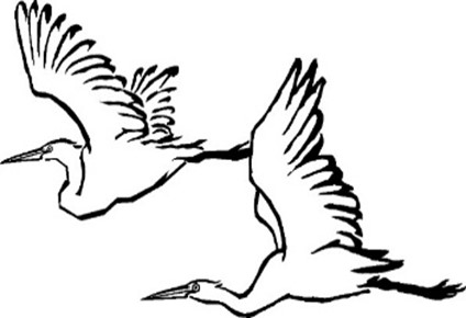
On 28 March 2018, CNSST’s first social housing project “CNSST Kotuku House” was formerly opened by Auckland Mayor Phil Goff. The logo which appears on the outside of the building features two ‘kōtuku’ (in English ‘white herons’) in flight. It was designed by Mr Haihui Wang, a prominent Chinese artist and long term volunteer at CNSST, and represents peace, love and good fortune, while also linking to Maori history of the area.
Five E Group Limited Logo:

Our new social enterprise for charitable purposes, Five E Group Limited(5E Group) was registered in April 2023. The stroke that caps the top of the group logo symbolizes auspicious clouds that shelter the emerging koru (fern leaf), the koru representing the company’s new beginnings and growth potential. The icon also resembles the capital letters ‘F’ and ‘E’ as used in an abbreviation of the name.
The five unfurling shoots along the inside of the koru represent the five core values of the group:
“Eco, Equity, Engagement, Empowerment & Entrepreneurship”
It is these values that inspire it and drive it towards future progress and excellence in achievement. The design overall embodies the enterprise’s charitable focus, with social good as its foundation, and conveys an impression of energy, growth, and the hope of a brighter future.
![]()